Pixar director Lee Unkrich is headlining this year’s GRAPHIC festival at the Sydney Opera House on November 10th and 11th. Plus there’ll be presentations from visual effects studio Animal Logic and other animation and music events.
Unkrich, who most recently directed Toy Story 3, will be going behind the scenes at Pixar, while Animal Logic artists Rob Coleman (Animation Director), Grant Freckelton (Art Director / Production Designer), and Aidan Sarsfield (CG Supervisor) will discuss VFX. There are further presentations by Fat Freddy’s Drop, a New Zealand soul outfit given an animated and illustrated album preview, and by Australian hip-hop collective Elefant Traks performing to Dr. Seuss imagery.
Check out the whole lineup here – graphic.sydneyoperahouse.com – and also read about the gaming workshop scheduled for the festival, and the animation competition to be judged by Animation Director, Marco Marenghi (Walking with Dinosaurs 3D); Director, Chris McKay (Robot Chicken TV series, Co-director LEGO: The Piece of Resistance), Animation Director, Daniel Jeannette (Happy Feet, Where the Wild Things Are) and GRAPHIC co-curator, Jordan Verzar.
Animal Logic gets GRAPHIC
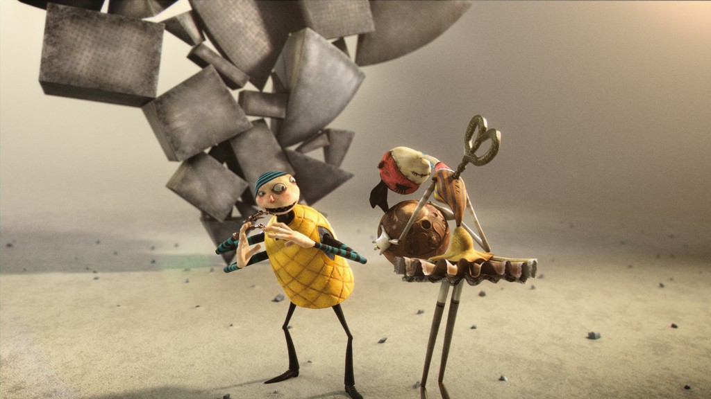
A creative partner behind GRAPHIC, Animal Logic also produced the festival’s promo piece – an animated encounter between two other-wordly characters. We talk to the promo’s director, Animal’s Toby Grime, about how it came together.
fxg: What was your overall brief for the GRAPHIC piece?
Toby Grime: The GRAPHIC promotional film was very much an open brief with just a couple of requirements. These being that I needed to show the Sydney Opera House somewhere in the animation, the feel of the short film was to be edgy and to promote the speakers and the Festival itself. We wanted to make this more than a credit sequence. We were keen to tell a quirky story with great characters and animation for GRAPHIC and to reference the very place that GRAPHIC takes place – the Sydney Opera House.
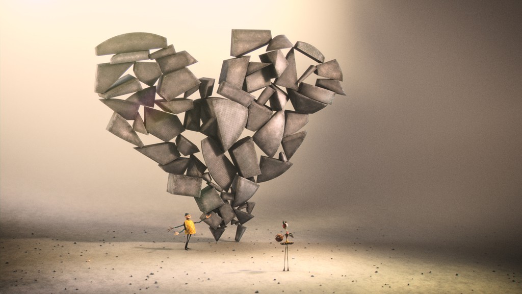
fxg: It’s such a great pay-off that the stone blocks form to become the Opera House shape – can you talk about the formation of this idea in particular?
Grime: I developed the narrative starting at the resolve of the story – with a fully formed Sydney Opera House. That was a given so I put that stake in the ground and worked backwards from there. Not entirely a traditional way to develop narrative, but it worked in this instance.
Being a resident of Sydney all my life, I have a natural love and respect for the Sydney Opera House. An amazing structure – what if it was created by accident? The core theme, ‘Accidental Genius’, through trying and failing, good things can come. I was keen to combine the idea of the happy accident and a juggling act into the story which then created the concept of a boy doing his best to impress the girl of his dreams. I’d been looking at some amazing Chinese acrobats balancing chairs and thought that there was a way to use this sense of suspense in the piece. The staged performance feel of the juggling act referenced the role of the Sydney Opera House in the creative arts scene – it’s a place of staged performance in its many forms.
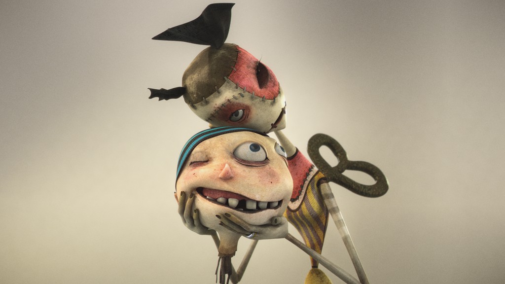
Through the boy’s attempts at impressing the girl of his dreams, he fails, but out of his failure is success (whilst missing his body of course). The male character is also rather deluded as he is after the attention of a wind-up doll, who really isn’t real. But does he care? I think the themes are timeless and it’s a simple boy meets girl narrative with a few twists and a little bit of catastrophe. Love after all, doesn’t discriminate. It’s also a nod to the whole animation and story telling ethos and culture here at Animal Logic!
I bounced the basic story structure around our core team Charles Santoso, Character Designer, Manuel Macha, Technical Director and Rob Coleman, Animation Director and of course Sydney Opera House and everyone contributed to bringing the piece to life.
fxg: There is, of course, such a great stop motion feel in the piece – can you talk about designing that both in terms of the look of the characters, but also the style of animation? What specific reference did you look to for that animation?
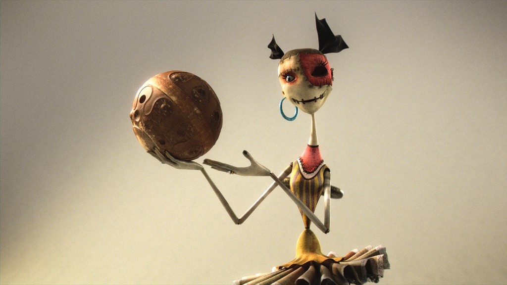
Grime: With the animation team, we looked at a number of references. We looked at some Brother’s Quay stop frame short films and in complete contrast – the Ken and Barbie sequence form Toy Story 3 as it’s such a beautiful character moment. The piece for GRAPHIC is straight out character animation, not so much stop motion in feel. Santoso did an amazing job in creating a pair of oddball characters. The boy has three arms, one arm being mechanical and three eyes. He’s a master juggler that is good at his craft due to the help of his third arm. His third eye helps him keep and ‘eye’ on his balancing acts. The girl is missing an eye (maybe the boy stole it from her when wound down?) and is a quirky wind-up style doll.
The characters were designed around a stick figure mentality – a classic form for classic character animation and the additional weirdness – the male having the three eyes, the three arms meant the animators had to really extend themselves and think about the idea of ‘What do I do with this third arm and eye?’. We talked about that notion and used the third elements, the eye and the arm as a way to action out and express another emotion whilst the main arms and eyes express the main story beat.
fxg: How did some of the design elements of the characters (such as their limbs and eyes) come about? What kind of color palette were you aiming for?
Grime: Our male character ended up with three arms. This was part of Santoso’s design feel for the character and it was such a great thing for the animators to have in their tool box. It throws open a different head-space of animation ideas. The girl wasn’t originally a wind up doll, that came half way through developing the story, but it worked so well and added more edginess to the piece. It opened up the concept of her winding down at the end, and our male character being unable to make his way back to his body. One thing that became apparent as we were doing layout was the role of the third arm and eye, which morphed into another aspect of our male character.
The color palette was created by the character designer, Santoso. He has a great sense of color and tone. The main thing was to differentiate our male and female character clearly across the film and all the livery, branding and print material for the festival. Santoso worked closely with Manuel Macha the technical director for the film who translated Santoso’s designs into surfacing the characters in high, rich detail. We worked loads of detail into the surfacing of characters as they are seen close up in the film, but also for the high-resolution print work that was used across all the posters and banners created for the promotion of the festival.
The rest of the environment was very neutral with a warm grade to let the characters pop in the overall look. The blocks used by the boy had a nice worn feel to them which was important in delivering the idea that the boy had done this a hundred times already – making sculptures for the girl of his dreams. We applied a macro dot screen texture to the blocks which was created by scanning in newspaper images at extremely high resolutions and used in the shader set up.
fxg: Can you talk about the tools Animal used for modelling, animation and rendering?
Grime: Maya was our main tool for modelling, rigging and animation. Pablo Plaisted, the layout supervisor did an awesome job blocking out cameras and previs in Maya. We also used ZBrush and Mari in combination with Photoshop for surfacing. It was also one of the first jobs to come out of Animal where we used our new physically-based (or plausible) shading and lighting pipeline.
With this system, all light and shader attributes behave in a very naturalistic and intuitive way. Switching to this workflow required a different approach when it came to lighting and compositing. Where we once broke down our shots into a lot of separate passes – and the final look of a shot was mostly determined in comp, the new physically based approach gives much better results straight out of the renderer.
In short we would render a beauty pass and one technical pass for both the background and the foreground objects. This means that the balancing of the lights had to be done in 3D as opposed to comp.
It took a few days to get into this slightly different method but it was a very pleasant experience working this way as we could reduce both the complexity of our lighting setup in 3D as well as our Nuke comps while at the same time pushing through more shots with a very limited crew.
fxg: What were the important elements you wanted to communicate with the sound and music?
Grime: One of the things I was keen was for the sound design to give the characters a voice and for the blocks to have weight and mass to them. The blocks suddenly took on this real weight which makes the whole decapitation scene more funny and more savage. It just all worked so well. The team at Smith and Western did a lovely job on this front. The musical flourishes they added then lift the whole piece at just the right moments. They added great sense of ambiance to the whole film that goes hand in hand with the feel of the animation and the textural look of the film. Play it loud. It’s worth it.
Overall it was a great collaborative, open creative project. All crew really enjoyed the experience and were really proud of what we created and really honored to be Creative Partner at the GRAPHIC Festival with Sydney Opera House.


