 Ken Cato of Cato Purnell & Partner recently completed a 3D title design sequence for the UK feature film Elizabeth: The Golden Age, at Iloura in Melbourne.
Ken Cato was approached by renowned Australian editor Jill Bilcock (credits include: Romeo+Juliet, Mouline Rouge, Elizabeth) to create a stylised title sequence for the film.
The title sequence was to act as a prologue to the film, establishing the period of Elizabeth’s reign in which the film begins: Europe has been plunged into a Holy War by Spain’s Catholic King Philip, who is headed to convert England at the price of its fierce Protestant Queen, Elizabeth 1st.

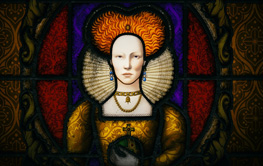
Ken Cato’s creative concepts for the sequence involved high end 3D design and chose to collaborate with iloura. Two of iloura’s illustrators, Sam Jensen and Kate Moon took concept designs and created illustrations depicting three separate stain glass windows. The illustrations depict King Philip’s Holy War, torture scenes of the Spanish inquisition and finally, the formidable image of Queen Elizabeth I.
The illustration of Elizabeth herself was particularly significant; it carries both the title of the film and the main character – a subtle blend between a true likeness of Cate Blanchett and believable depiction of the historical queen in a regal stained glass composition. Once the illustrations were completed iloura designer Neil Huxley edited the sequence together – all timings in the edit had to be resolved before it began its transition through a 3D pipeline.

The edit was then imported into 3D studio max where senior 3D artist Josh Simmonds developed textures and mapping planes that would give the stained glass its unique and textured look. The design and animation team took care to research the techniques of the ancient master craft and they succeeded in evoking those qualities by replicating the inherent flaws found in the organics of stained glass. They created a sense of depth and color to the imagery through the use and manipulation of 3D lighting.
Text also plays a major role in the piece – in the obvious sense it narrates the story, and sets the scene of the film but it was also very important to Ken Cato that text be integrated with the stained glass imagery and not simply float on top. The use of Gold on Gold was a priority for Ken to achieve this end. The challenge was to keep the text legible but also have it work within the overall composition as a design element. Once the font was decided upon the team at iloura created it in 3D, Alan Fairlie composited the final sequence and on-lined in Shake.
