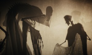
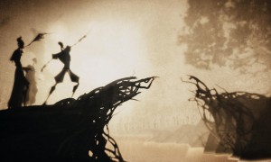
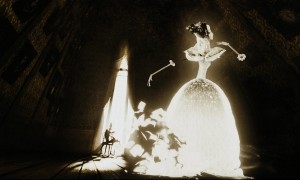
The crucial origin of the ‘Deathly Hallows’ is told inside the latest Harry Potter film via a three minute animated sequence directed by Ben Hibon and created by Framestore. In it, we learn of the story of the Three Brothers and their encounter with Death. Sequence supervisor Dale Newton tells us how it came together.
Watch for more HP7 stories, podcasts and interviews coming up here at fxguide. UPDATED
fxg: How did Framestore get started on this animated sequence?
Newton: One of the things that got me excited about it in the early stages was the question of what it should look like. We knew it was going to be stylised, but not exactly how. The producers came along with the suggestion of creating something in the vein of Lotte Reiniger, an Austrian-born animator working in the 1930s and 50s doing silhouette style animations. What we got out of that was a certain simplicity and naivety. We knew it had to be told very graphically with bold silhouettes. But Ben and I were keen to make sure it wasn’t only that, that there was something else we could add.
Ben brought along the notion of Eastern shadow puppetry in terms of projecting shadows onto a cloth via a flame. The way that they made these things was to stand behind a bunch of pole puppets and have a fire burning. The closer you were to the fire the more blurry the shadows became, whereas the closer you brought your puppet to the cloth or the surface upon on which the story was told, the crisper it appeared. So we tried to transfer that device and use that in our animation. It was something that was quite enigmatic in terms of drawing on blurry shadows and indistinctness.

fxg: How did you come up with the final look?
Newton: Well, as a keen designer myself I was quite keen to get engaged in that personally. Ben brought a lot of the visual concept with him by doing some of the initial artwork. This really laid the ground work for the sepia tones and the way that there was this paper grain across everything. We had no idea initially how and where that was to be integrated. I got an intern, Alexis Liddell, who is a great artist, to work with us for the duration of the show. Between Ben, Alexis and myself, we were able to get pretty much all of the key concepts from a design point of view by about six weeks into pre-production. The approvals for those designs went through pretty quickly as well and we were able to go off on our own and come up with these concepts.
fxg: The detail in the characters is quite amazing, but what I liked is that you don’t actually see it at first because I think initially you notice them only as silhouettes.
Newton: Yes, it was actually a key thought to make things appear very clearly just by using tonality from light and shade, but we were still conscious of the fact that we didn’t want it to look simple. One of the things we worked out very early on was whether it should be a true three-dimensional production or whether it was to have a fake two-dimensionality to it. A few years back we did a sequence for The Tale of Despereaux, where we created this very interesting flat storybook sequence. We built flat rigs but played with perspective. So we were toying with doing a similar thing here.
But we ditched that early on, realising that we would be moving the cameras around an awful lot, and there was no way to maintain the 2D. In deciding to go 3D, we also decided to build in a richness, a detail, into the look. So we got a texturing team in who worked up colour maps and displacement maps in Zbrush and made really lovely and rich textured surfaces. So even though the designs were quite stylised with very clean-looking curves, there were actually no clean curves and no straight lines. Everything was enriched up. At the point of doing that, we didn’t actually know which bits we would be seeing on screen as the animators were only just beginning their task. So we had to put detail into everything. We also didn’t know where the light would be falling either, so we built all the assets with the richness that we thought we might need and hoping we could then splash some light here and there or bring it out in the comp where and when we needed it.

fxg: And along with the actual characters there’s the texture and the fog in the scenes. How did you achieve that?
Newton: Out of all the early character designs, we really wanted to keep the feeling of the overlay of the paper texture. If you’re moving the camera around as much as we did, it would look like it was moving over the the paper texture too, like some dirt on the screen. So one of our compositors started playing with Nuke. There are some pretty cool features where you can add the camera moves from Maya. We would then create layers of paper that he could insert between the renders, but in 3D in Nuke, and control them in a compositing way so as to subtlety layer them in.
fxg: What were some of the other tools you were using to do modelling and animation?
Newton: The pipeline involved modelling in Maya. We had to put things through Zbrush if they needed any sort of displacement. Then things were rendered though mental ray. For the bridge part of the sequence where it grows, we used Houdini and rendered in RenderMan. We used nCloth for the robes and the bride’s dress. Our CG supervisor James Healy worked up a pipeline for us in Maya for that. And then there was Nuke for compositing.

fxg: Can you talk about the style of animation?
Newton: We tried a few things to get a gritty and hand-made feel. The inspiration was the way Lotte Reiniger had the childlike-ness for her animation, but we didn’t necessarily want it to look like a stop-motion piece of animation. Because of the camera moves, we couldn’t always split things down on twos. So we couldn’t rely on any sort of technological roughing of the edges. The one thing we were keenly aware of at all times was the silhouettes which enabled us to play on a certain theatricality. The hands do so much of the talking – Death’s hands for example are almost as expressive as his face is.
When we designed the characters, we tried to purposely design puppets. So we didn’t give the characters, for instance, whites in their eyes. You didn’t want to read them through, say, traditional blend shapes on their heads. It all had to be told throughout their entire pose. We were very conscious that the attitude of the characters at that point had to be read through their entire pose. This forced us into thinking theatrically, and we should feel like we’re watching a very clever puppet show, not a traditional character-animated movie.
Watch for more HP7 stories, podcasts and interviews coming up here at fxguide
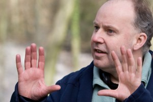
Pictured right Director David Yates on the set of Warner Bros. Pictures’ adventure “HARRY POTTER AND THE DEATHLY HALLOWS – PART 1,” a Warner Bros. Pictures release. Photo by Jaap Buitendijk


[…] http://www.fxguide.com/featured/framestore_deathly_hallows_animation/ […]
[…] http://www.fxguide.com/featured/framestore_deathly_hallows_animation/ […]
[…] http://www.fxguide.com/featured/framestore_deathly_hallows_animation/ […]
[…] http://www.fxguide.com/featured/framestore_deathly_hallows_animation/ […]
[…] http://www.fxguide.com/featured/framestore_deathly_hallows_animation/ […]
[…] http://www.fxguide.com/featured/framestore_deathly_hallows_animation/ […]
[…] beginning an animated sequence of the silhouettes in motion. (Instead, a three-minute animation was made independently by Framestore in the final […]
[…] os anos 30 e 50 pelo animado austríaco Lotte Reiniger. Em sua entrevista para o site Fxguide (link), ele conta que foi ideia do diretor da animação (Ben Hibon) que ela trouxesse referências […]