We all know the incredibly complex visual effects work that goes into Marvel’s films, plus the motion graphics for HUDs and monitor displays, and the often elaborate main-on-end titles. But an equally large effort is also often required for trailers – especially in crafting memorable titles and graphic effects seen in the trailers, sometimes before the film has been finished or even shot. One artist who has created trailer titles for big films in recent years is Fede Ponce. He’s worked on several Marvel and other studio trailers for different marketing agencies and as a freelancer, and he runs through just some of his work for fxguide.
Above: Thor: The Dark World trailer. Agency: mOcean
fxg: How did you get started working on these kinds of trailers?
Ponce: It started a long time ago with the first Hitman movie for Fox. I was working in a very small studio called Create Advertising in Los Angeles. This was the very first time the studio wanted to do a very heavy CG trailer campaign. It was quite a big breakthrough moment for the industry because nobody had really done that before. There were always the cards and ‘Next Summer’ but there had not yet been an integrated or well thought out campaign that included graphics. What was really particular about that trailer was, because the movie wasn’t finished by the time we were supposed to roll it out, we ended up composing a lot of scenes and visual effects on our end. After people saw what could be done for main titles on trailers, they really wanted it for every trailer after that!
fxg: What sort of time frame are we talking in terms of working on these trailer titles?
Ponce: They are marketing campaigns, which means we might be getting the project two or three years before the movie is out. And so we have to foresee and plan out everything from the theatrical teasers – this might be a glimpse of the main title – to the trailer. Then there are variables of the trailers, and then to TV spots, and to print and billboards. The whole campaign can last for say three years and end with home video. So when we get a project we have to foresee the entire lifespan of that project.
Once we have the entire strategy thought out for the two years ahead, then the thought process comes in and we start with sketches. Sometimes the client will want to mimic a look and sometimes they want to do something conceptual, and that’s when they let us read the script and come up with something entirely new. So there we design the typeface based on an idea it’s supposed to convey. We’ll do mock-ups of how that will look on posters, multiple screens. What’s getting a little complicated now is that there are a lot of outlets. You have your 16:9 TVs, plus experiential places like Times Square which have tons of different screens. Then there’s cell phones. So we have to think about how our different designs will play out on all those different screens, which gets extremely complicated.
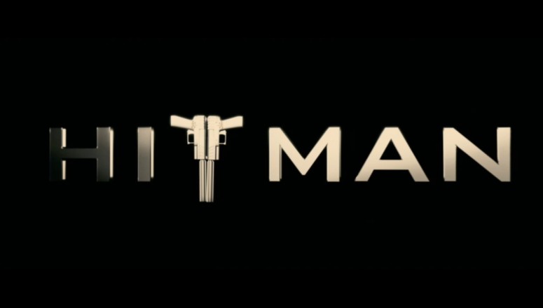
Above: Hitman trailer titles design. Agency: Create Advertising
So we’ll start sketching things out, the client will select what they like and we’ll start producing them in ZBrush or Maya. A lot of the time these are custom made typefaces or objects. As an example, we were required to make a concept for Thor’s hammer but it wasn’t made yet – so we had to make that asset. In another instance, the client wanted to include Iron Man’s chest piece but the piece wasn’t made yet either. For the final work we’ve always used Maya and After Effects, but now we do use Houdini for effects and some compositing in NUKE.
fxg: Can you run through an example, say for the Thor: The Dark World trailer?
Ponce: That was a really interesting scenario. The way it used to work before was, the print department in an advertising agency used to be the design department that dictated the look of something. And then that just translated across the spectrum. What happened with Thor and Iron Man was that they actually reversed the current of design.
With Thor: The Dark Word, we had to make up these usual trailer elements but also ones that could line in print and mobile. So what I did was I actually sat down and designed a lot of different typefaces for Marvel. These were all hand-drawn typefaces. When you design the typeface you have to create the entire alphabet. As I was creating the sketches it became increasingly difficult to do because there was so much detail embedded into the letters that the only way to show them was to make the 3D structures for it. It was a risky proposition, really, because we spent a long time doing it and if they didn’t like it…well…but they did like it!
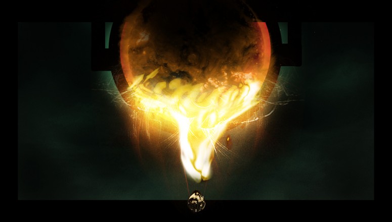
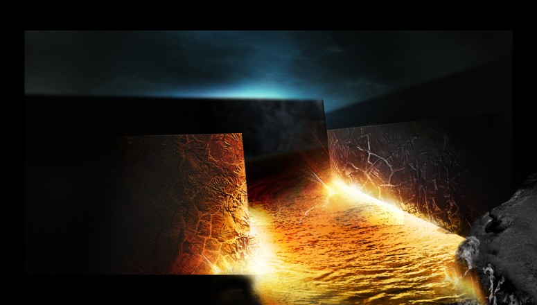
Above: Iron Man 3 trailer. Agency: mOcean
fxg: What did you add in to the typeface in particular?
I received a brief with a lot of patterns for Thor’s armour and his hammer. The idea was to use some of those patterns inside the letters. One of the versions was for the letters to be reminiscent of the patterns in the hammer, so that’s what I used. We also do the backgrounds. There was a cloud simulation mixed in with some footage and some particle fx for the lightning, and flares as well. It has to be done in 3D because most of these titles will go out in stereoscopic. So for these titles to live properly in 3D they have to be made in a 3D package.
fxg: How about the Iron Man 3 trailer?
Ponce: For that we had to adhere to very strict requirements, the color of the red and quality of the metal. When we were working on this project there were some concepts for the evolution of the suit but there was nothing actually built yet. So we looked at some past and future concepts. We then made our version in 3D, and it was funny because we didn’t know what the final suit was going to be. And what happened is we actually made a full suit, but because we never knew what suit it was going to be we had to obscure everything and leave just the core there.
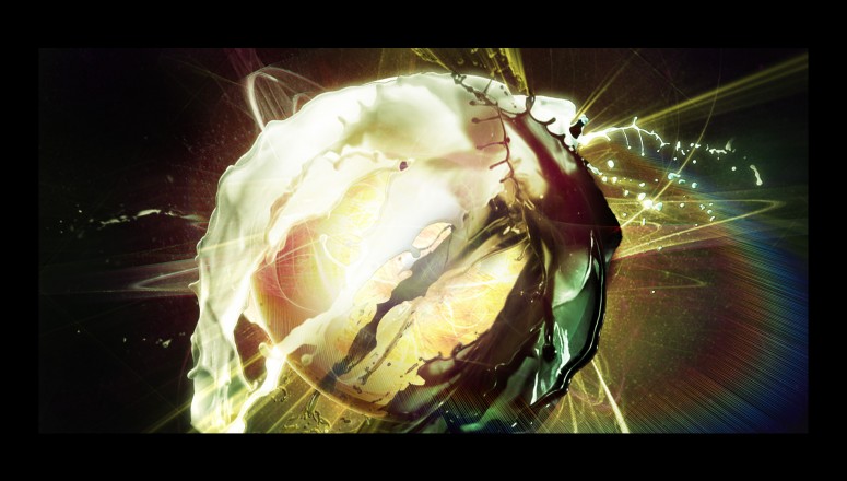
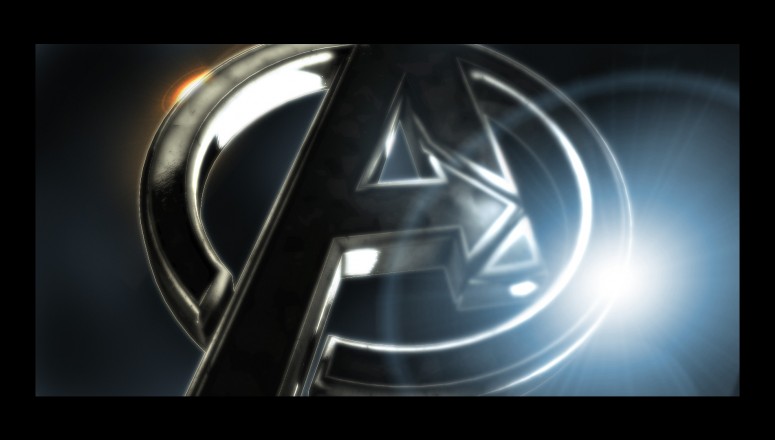
Above: Avengers trailer concepts. Agency: The Ant Farm.
fxg: On your website you have some concept art for an Avengers-looking trailer – can you talk about that?
Ponce: The Avengers project – that was a really old project, way before The Avengers was anything. This was an idea where the studio approached us to say, hey we’re thinking about bringing all the superheroes together for a movie but we want to announce this in a very abstract manner, how can we do this? I came up with this concept where you have this liquid metal that merged with other types of liquids and solids, and it’s all combined into this energy that disIpated into this evil black goo. It was all very abstract. The concept became hot metal that flowed into the lines that make up the ‘A’ for the Avengers. The concept ended up not going anywhere but I loved it because it was so abstract.
Fede Ponce recently launched a Kickstarter campaign for a new cinematic universe called Sebastian: The Slumberland Odyssey.