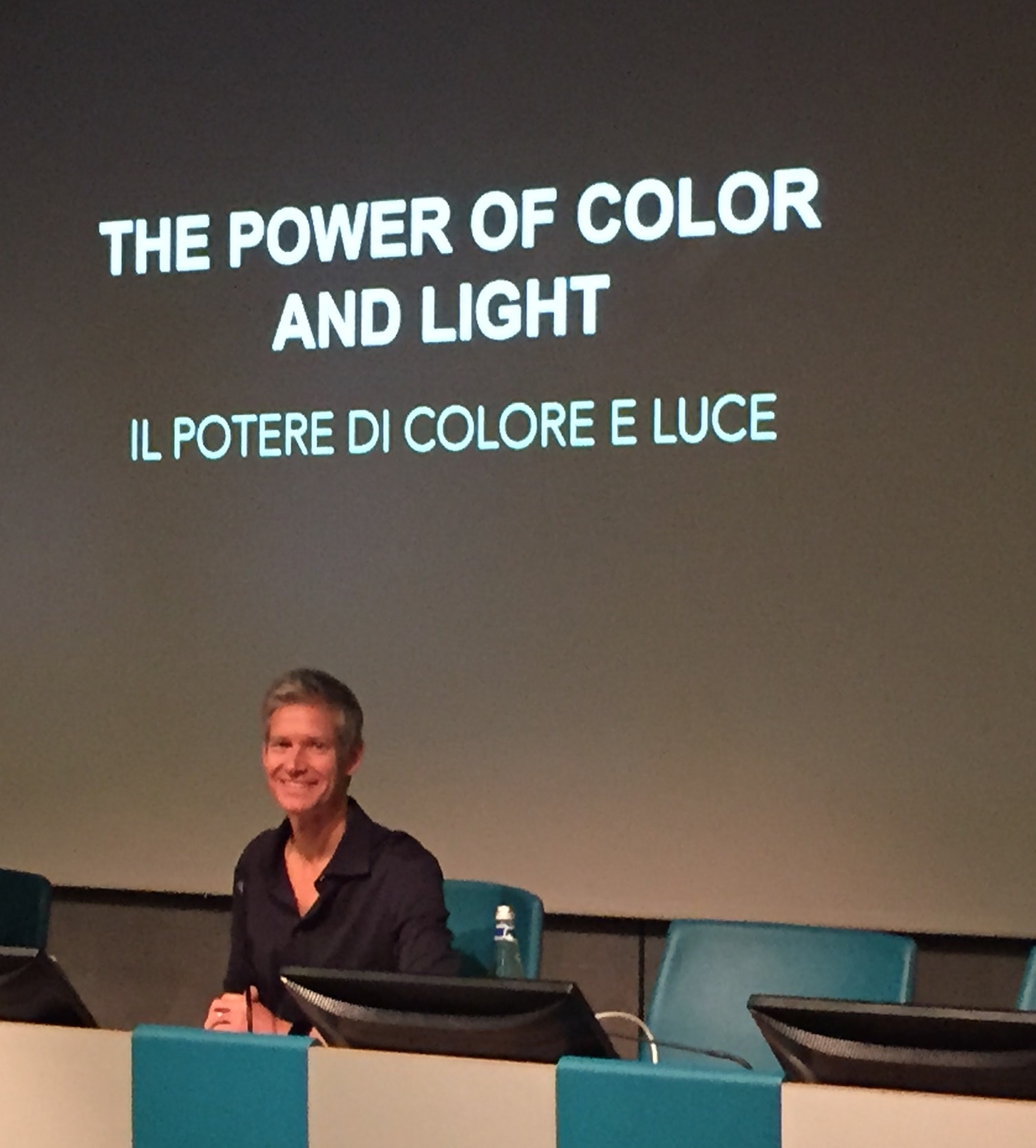
The VIEW Conference in Turin, Italy has just begun and we’re here to cover all the action. This week we’ll be talking to many of the big studios and directors attending. One of the first talks was actually a workshop on crafting colorscripts from Sony Pictures Animation production designer Michael Kurinsky, who recently worked on Hotel Transylvania 2. Kurinsky showed his colorscripts from that production as well as Open Season and Cloudy with a Chance of Meatballs. The real takeaway from this workshop was that the colors and lighting you see in most animated features you see are the result of deliberate choices aimed at evoking the mood of each scene.
A color script is, as Kurinsky put simply, a way to map out the color, lighting and emotional beats in an animated film. Certain colors have clear mood connotations, such as yellow being happy and blue being sad. The combinations of these colors can subconsciously make you experience different emotions. One interesting part of the Kurinsky’s approach to colorscripting is that he purposefully watches a lot of movies. Sometimes he’ll take frame grabs from certain movie scenes – live action or animated – and bring them into Photoshop. There he’ll do an abstraction of that scene (essentially pixelating it) to see the main colors – or color bars.
Open Season was the first film Kurinsky used as a case study here. He says Sony worked initially more with natural light while designing scenes, rather than theatrical light. Interestingly, this was partly because at Sony, the Imageworks team there had of course been working heavily on live action visual effects and animation which leaned more towards natural light.
Above: Kurinsky in a video from Sony Pictures Animation discussing his role as a production designer.
The film was also one that relied heavily on complimentary colors – for example the camp fire scene which took advantage of blue and orange – blue/green for the backgrounds and a warmer orange light for the characters – and this made the characters pop off the screen. In fact, that was another interesting observation from Kurinsky – he noted that sometimes he’d be involved in painting backgrounds and that they would look almost unfinished. But, he says, that’s exactly what they should look like – they should look perfect for adding characters to.
On Cloudy with a Chance of Meatballs, Kurinsky took colorscripts to a new level, helping the then novice animation directors Chris Miller and Phil Lord (who have since gone on to direct The LEGO Movie), to define color and lighting in the film. Each of the three Acts was clearly defined – from gray, desaturated colors suggesting the depressing state of the main character Flint’s town and existence in Act 1, to the over-the-top rainbow color explosion of Act 3 where much action takes place.
Flint himself was defined with the color blur. Kurinsky gave that color the complimentary color of orange – “You won’t be able to not see orange and blue together if you re-watch the movie,” he says. Even Flint’s father’s tackle shop features blue and orange, although somewhat desaturated – the idea here is that the colors represent an extension of Flint.
There were several moments in the film that took advantage of fun colorscript development. For example, the ’Sunshine and Lollipops’ song moment with the explosion of bright colors was inspired by a moment in The Lion King for the ‘Can’t Wait to be King’ song where the colors become oversaturated. Later, when things go from good to bad with the introduction of the spaghetti tornado, Kurinsky introduced a color change into a 360 degree camera move in which the lighting changed drastically showing that a disaster was imminent.
Above: Making of the colorscript on Cloudy.
Hotel Transylvania 2, a sequel of course, saw Kurinsky take what had already been done on the first movie in terms of colorscript and production design, and build on it. He was able to introduce new looks for the hotel, especially for the opening wedding (“I could be a wedding planner!” declared Kurinsky) and play with contrasts between the monster world (very saturated) and the outside human world (more dull and desaturated).
Atmosphere in the monster world became an important part in telling the story in the monster world, partly again to push the characters off the screen. A scene with a rich background would incorporate atmosphere so that say a sea of trees would go back into the background and become a sea of blue-green. Kurinsky was also concerned that too much detail in the tree branches and leaves would interrupt the animation of the characters, so atmosphere helped here, too.
The human world, visited by Johnny and Mavis, is far more natural and desaturated, designed to represent what Johnny sees as boring and lame compared to the monster realm. Johnny’s parent’s house, for example, was given tan, mauve and cream colors (although these were somewhat ramped up during production but still offered a contrast to what we see at the hotel). Kurinsky suggests that in building up a colorscript you should in fact push things almost as far as they can go, knowing that it might be brought back a little.
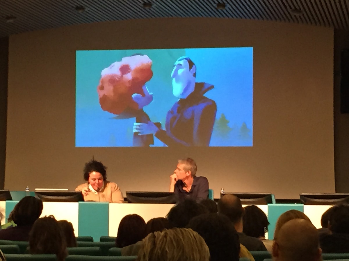
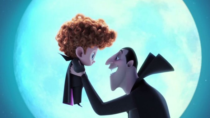
At one point, Count Dracula takes his new grandson, Dennis, for a flying lesson. The scene was a challenging one to realize in terms of colorscript because it carried the emotions of a warm and tender moment between grandfather and grandson, concern and fear from the monsters who come along to watch, and an action/adventure moment during the flight. But Kurinsky found that he could achieve all three emotions using moonlight from a full bright moon in the scene. The characters in front of the moon provided sweet imagery, while reverse contrasty light from the moon worked for the scared monsters, and some rim light still from the moon over the flying Dracula in bat form worked when the action started.
This workshop was a great insider view of the colorscript process. Kurinsky’s discussion now makes me want to go and revisit the films he talked about, and others, just to study the colorscripts. The production designer will be delving more into Hotel Transylvania 2 later in the week, and we’ll be bringing you reports from other talks here at VIEW from the likes of ILM, MPC, Imageworks, Blue Sky Studios, DreamWorks Animation and more, along with special fxinsider content for our subscribers.